
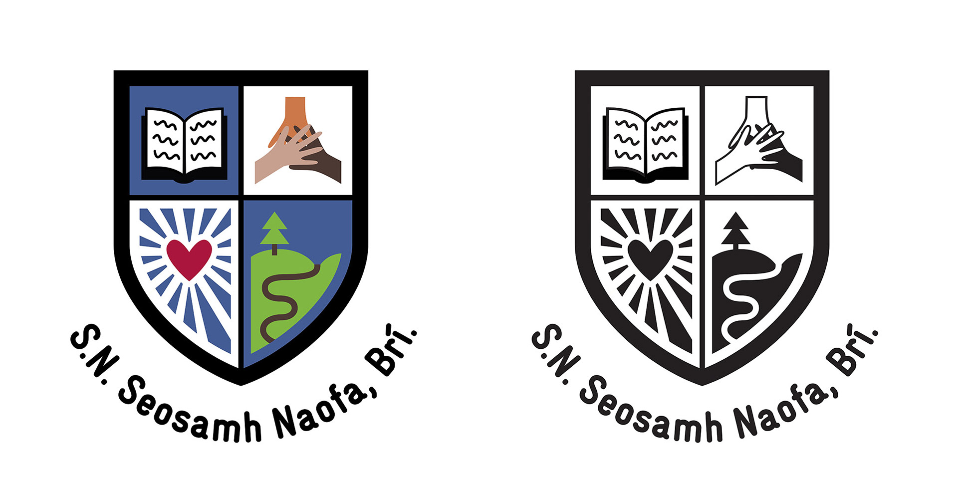
Above: A crest designed for Bree National School in Wexford. The school had kids draw what they wanted to see on a crest, then myself and illustrator Fuchsia MacAree took out the four that represented the school best and she redrew them in a singular style.
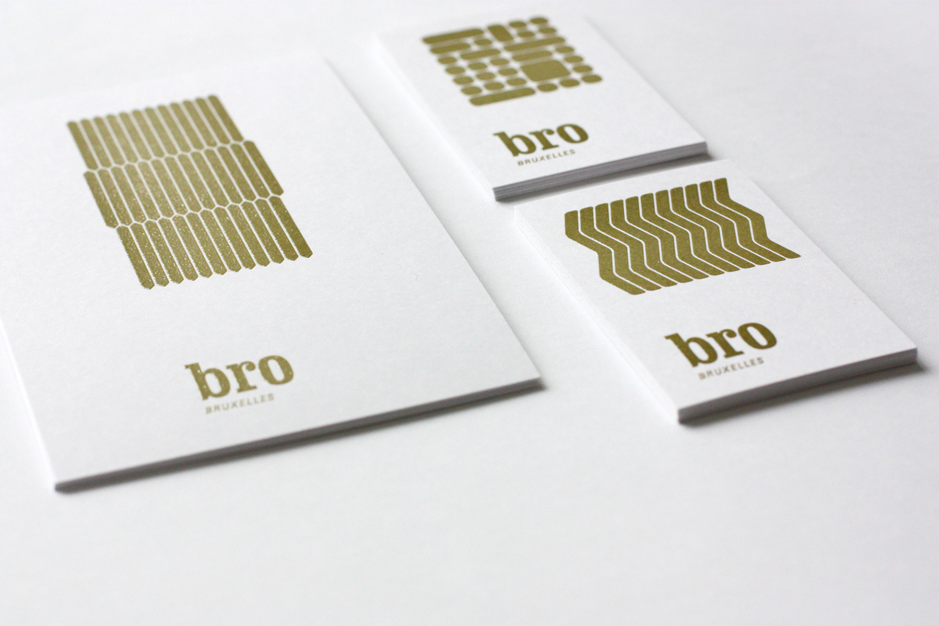
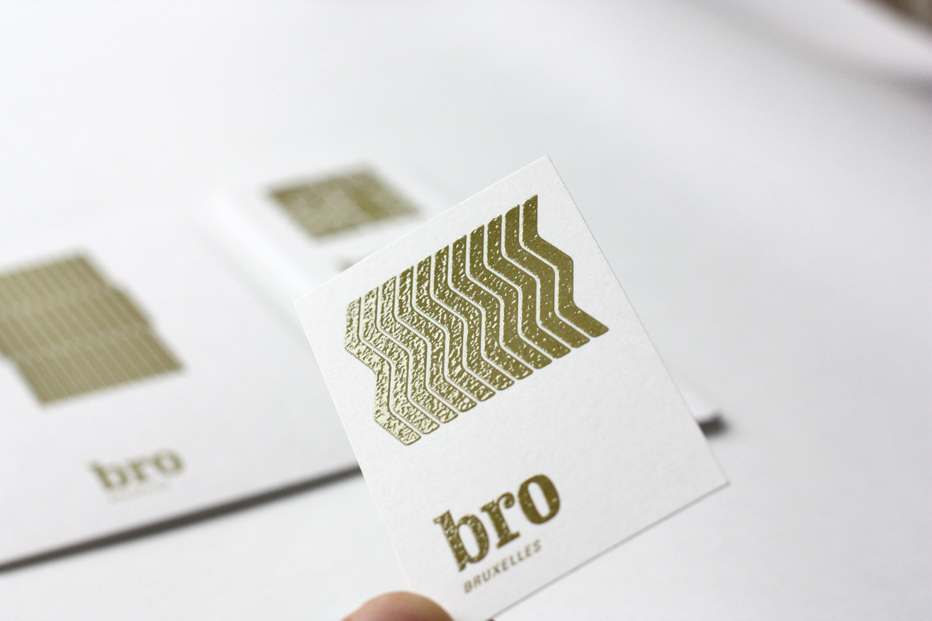
Above: Bro vintage is a Belgian company dealing in vintage Danish interiors. We used thermography to print the stationery making it very tactile, and based our designs on old ceramic patterns.
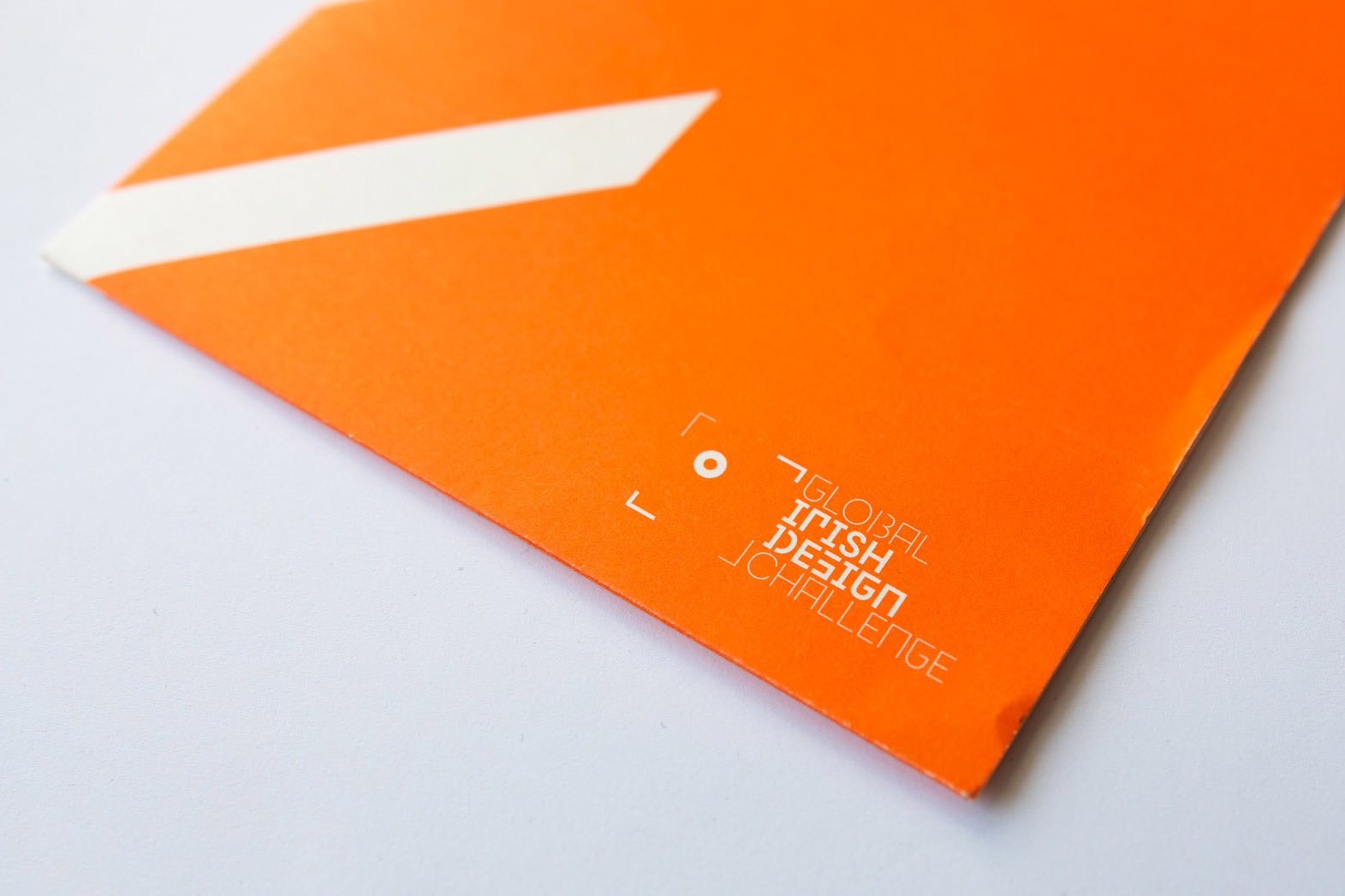
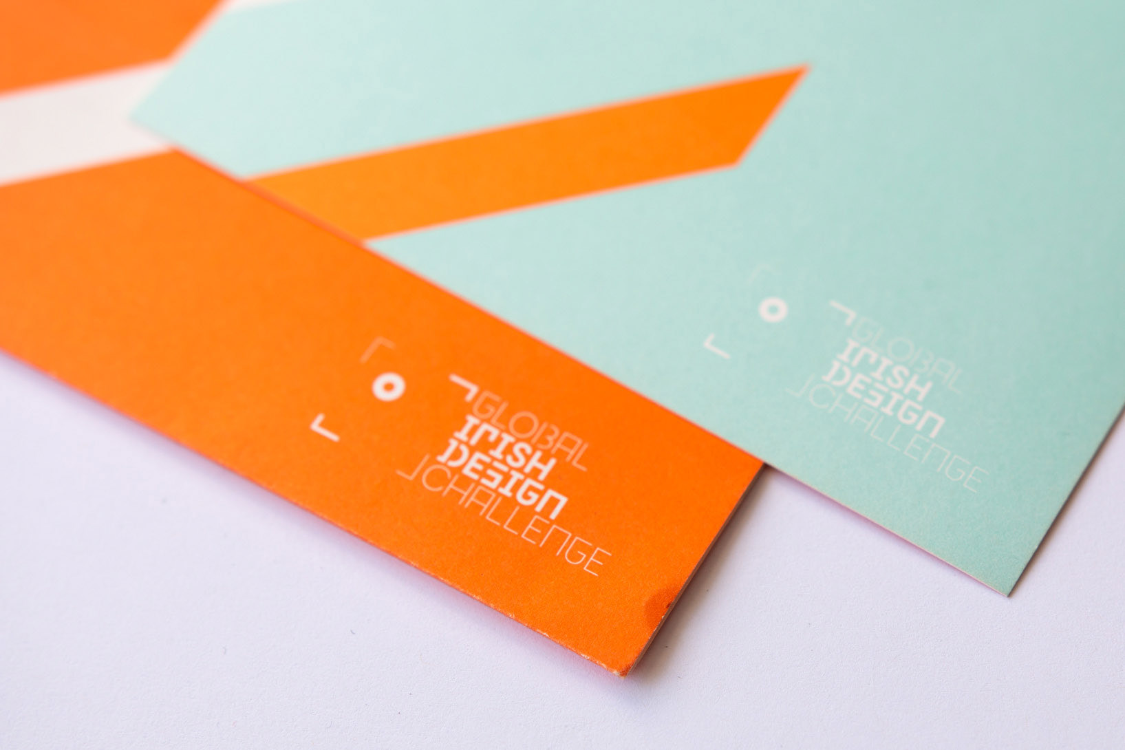
Above: Brand design for the Global Irish Design Challenge, an initiative by the Design & Crafts Council of Ireland to showcase the work of Irish Designers working abroad.
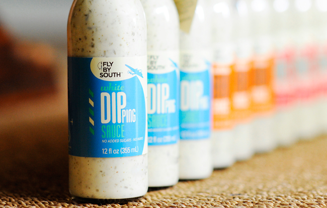
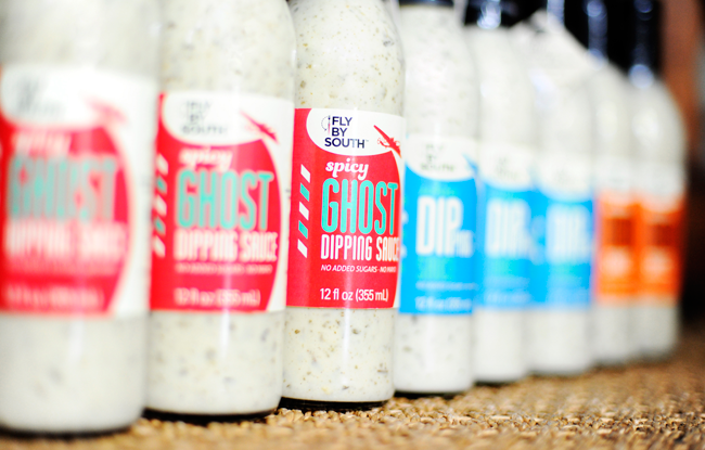
Above: Brand and packaging design for a small producer of sauces in Atlanta, Georgia: Fly By South. As the brand owner is a professional pilot all the work references flying.
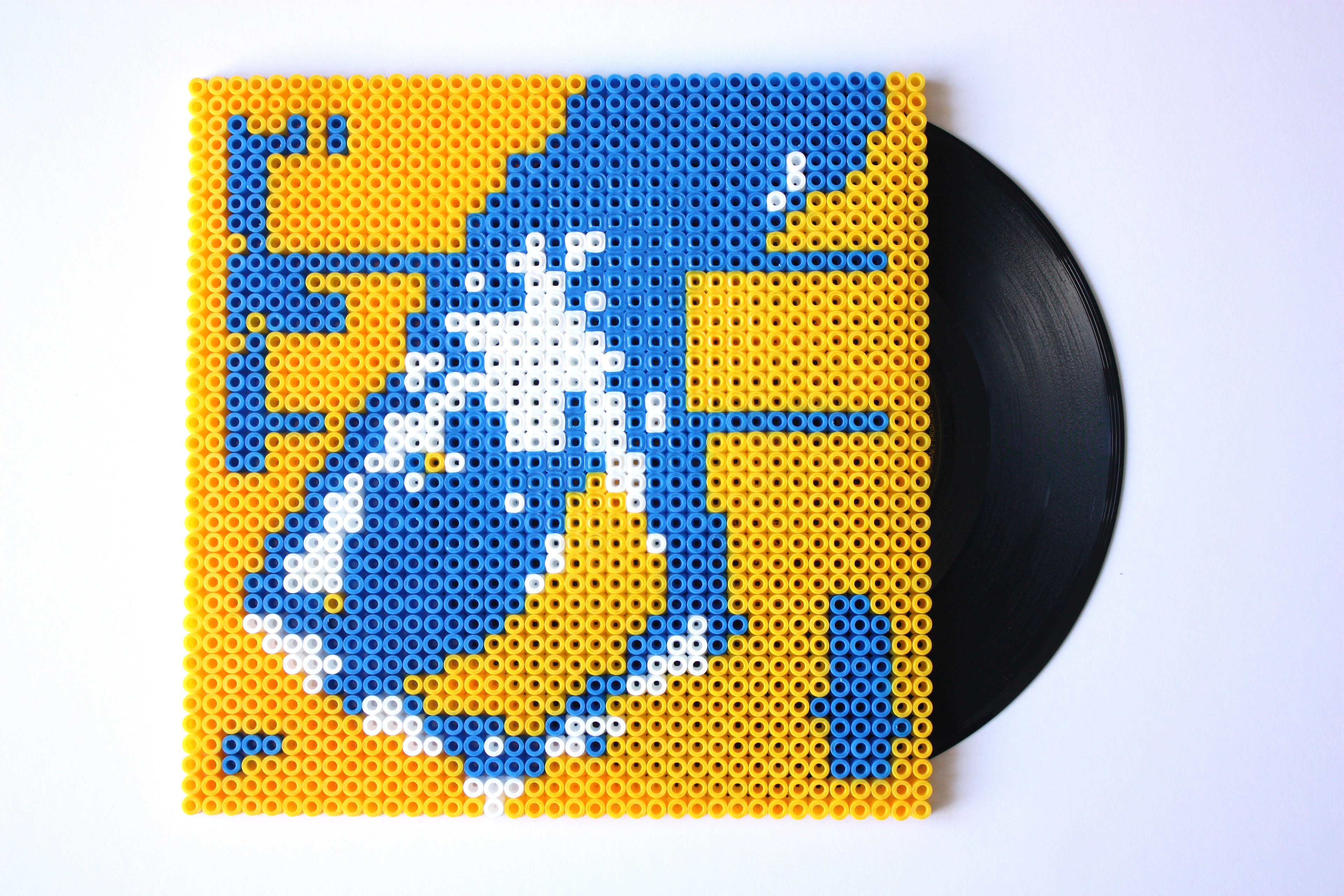
Above: My contribution to Orgasm Addict Reframed, an exhibition as part of Manchester Design Week. It is a personal graphic interpretation of Malcolm Garrett's iconic 7" sleeve for the Buzzcocks. I used Danish Hama toy beads to reference the DIY punk ethos of the band.
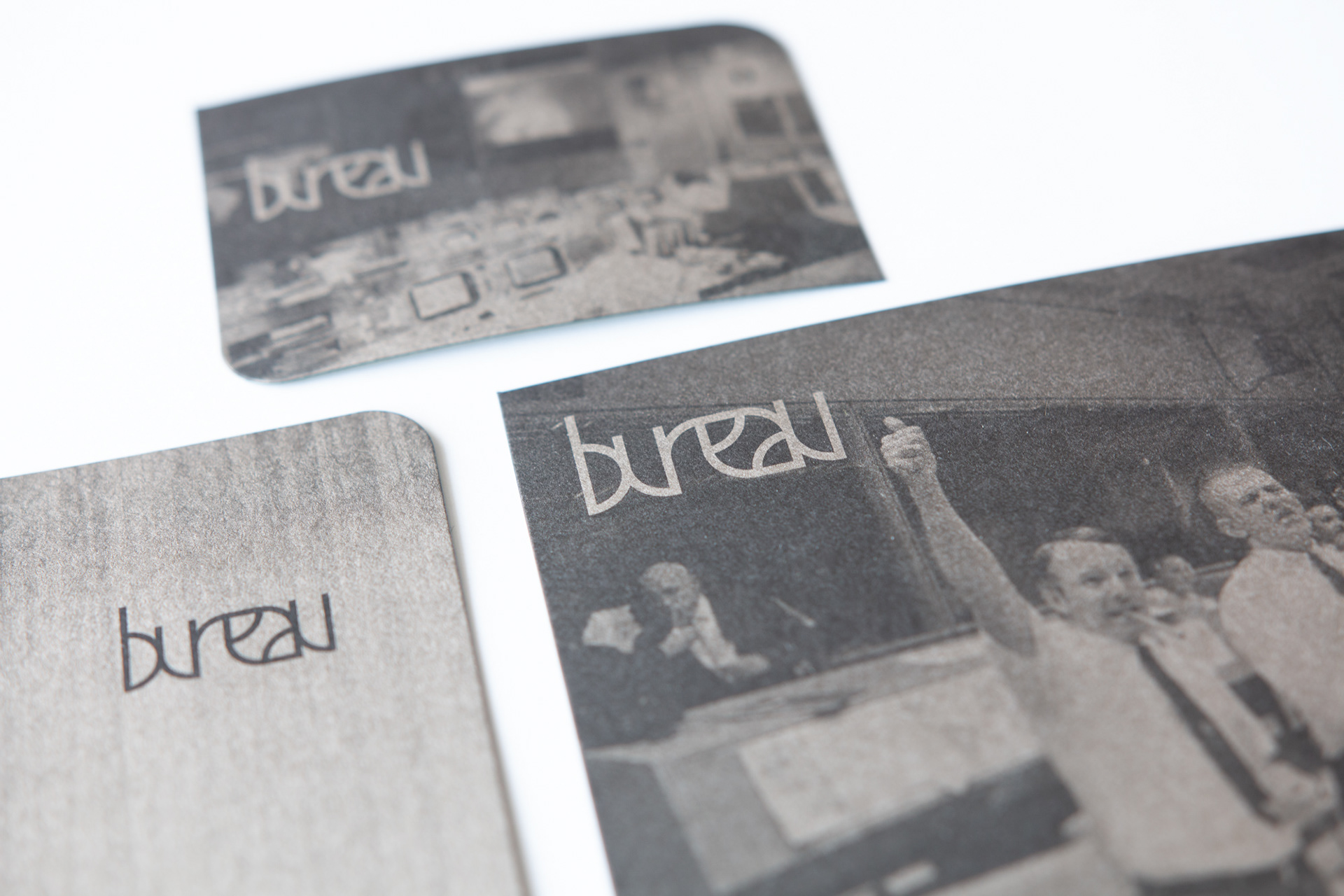
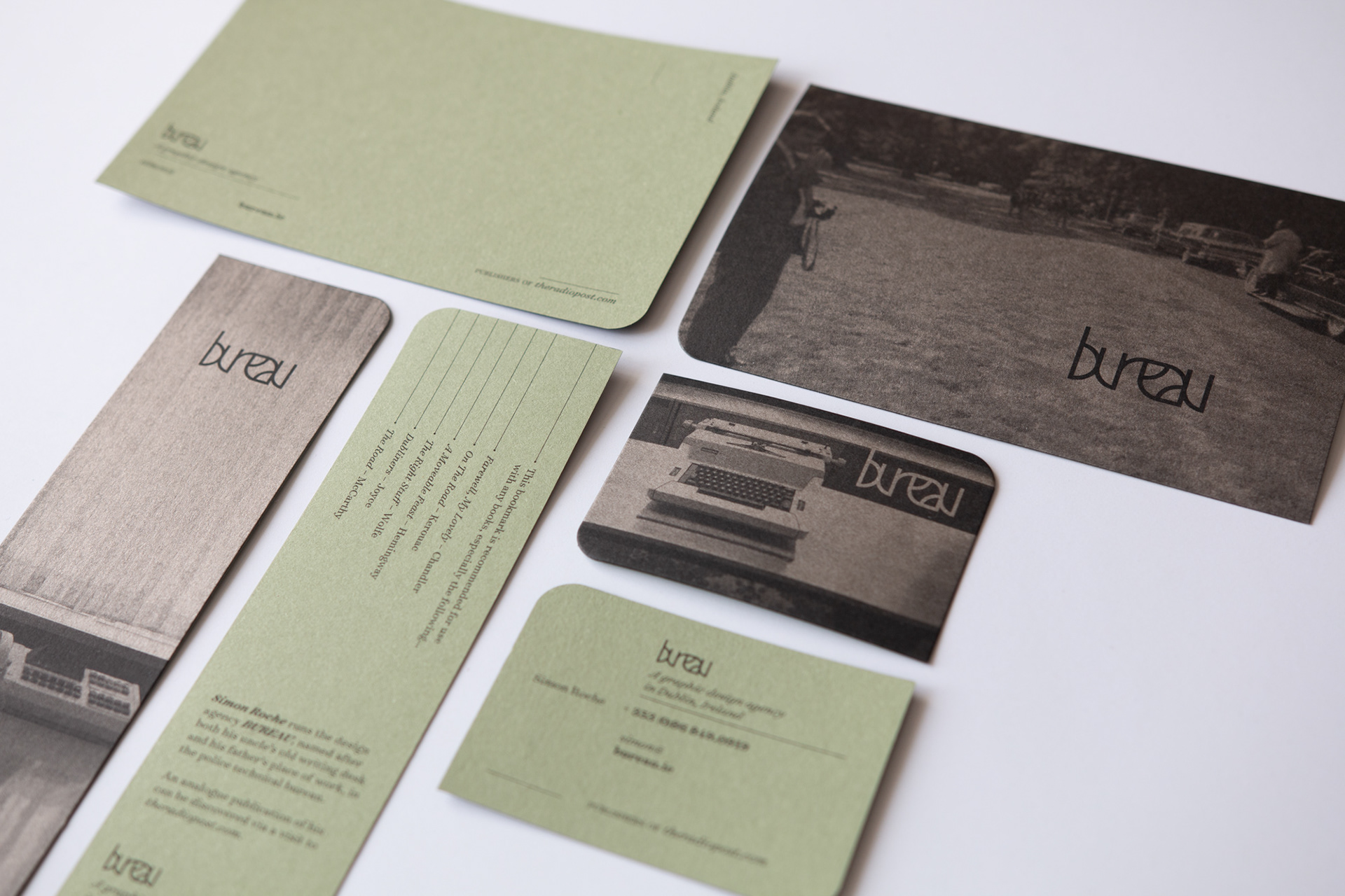
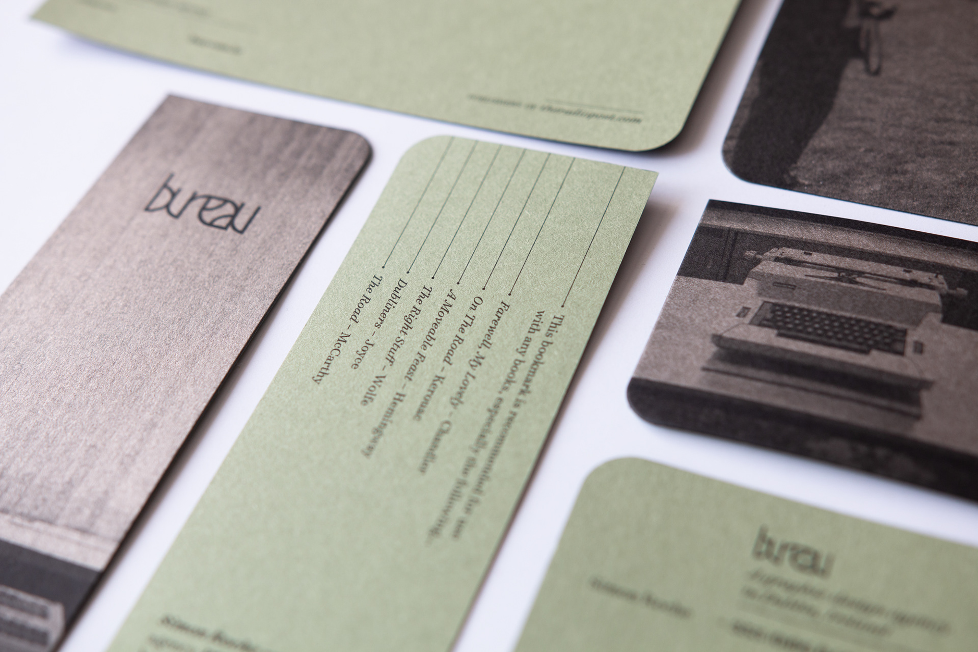
Above: Bureau's own stationery. Single colour on each side, a duplexed 1950s green (we'd like to think) and black paper. Business cards, postcards and bookmarks.
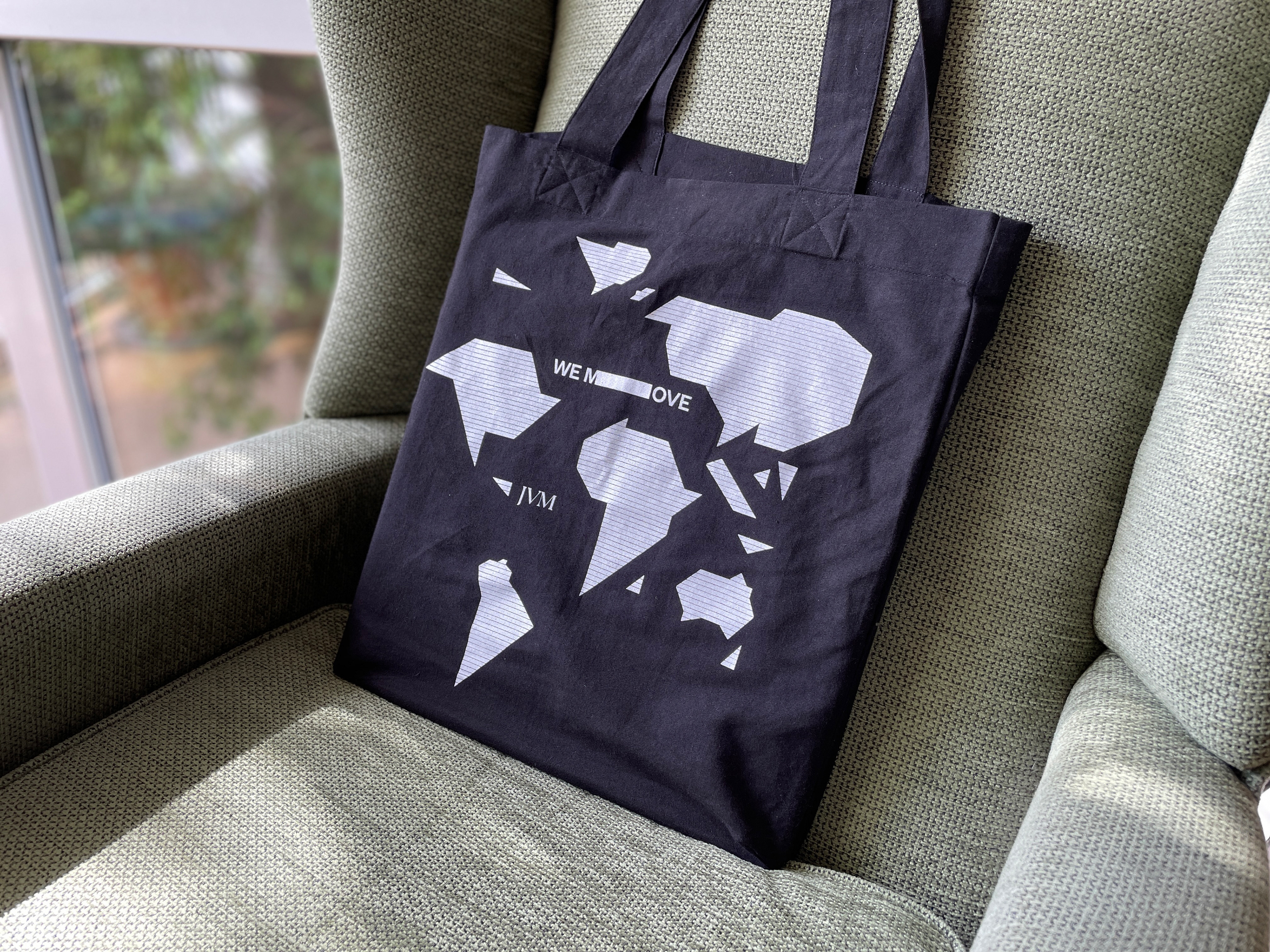
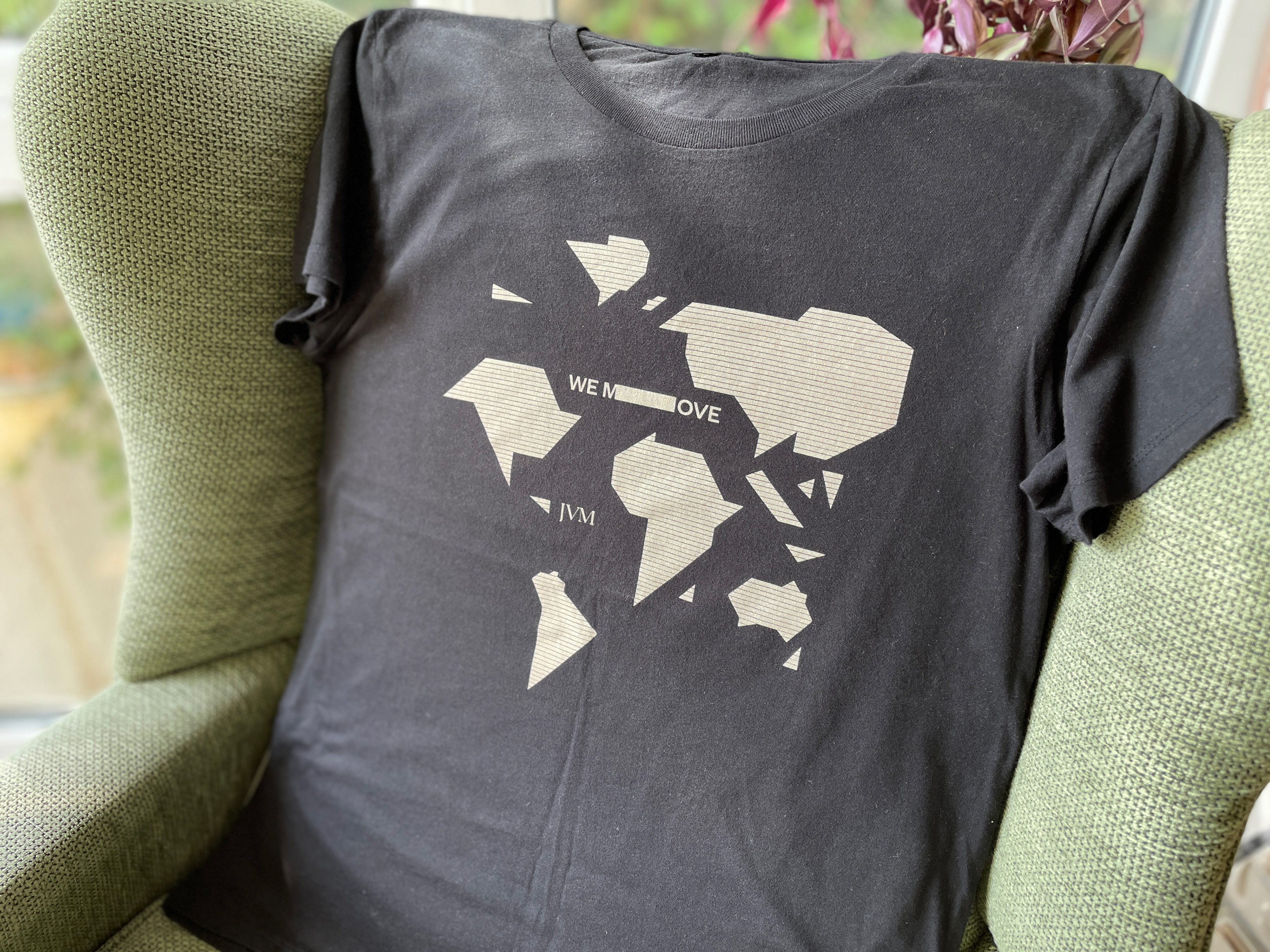
Tote and t-shirt for James McMorrow's 'We Move' tour, based on the future state of Pangea.